Tweaking Sofa's Home Screen Design
Sofa 4.0.5 redesigned the Home Screen layout for the Logbook and Pinned Items. The new design is more scannable and takes up less space while retaining the app's quirky personality.
For Sofa 4.0, I redesigned the Home Screen to include rich, widget-style cards for the primary lists: The Pile, Logbook, and Pinned Items.
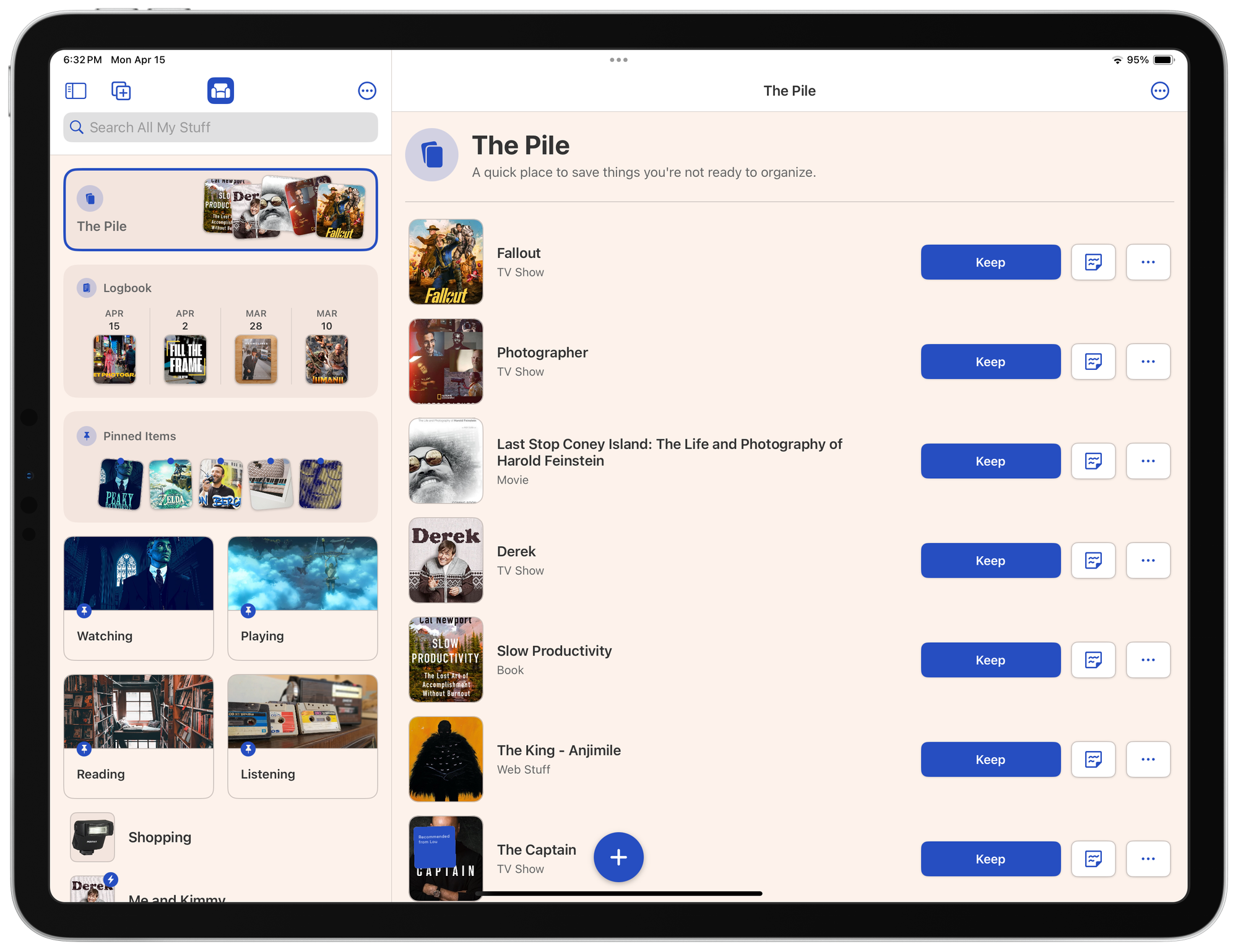
I liked that this gave people handy, scannable information about what's inside each list, but also brought a quirky style to the app.
Since the release, I've been running into some layout issues across devices which gave me a chance to iterate on the design a bit. I personally love the way The Pile card is designed. You have the title on the left, and the contents on the right. I wanted to see if I could bring that same structure to Logbook and Pinned Items. It turns out I can!
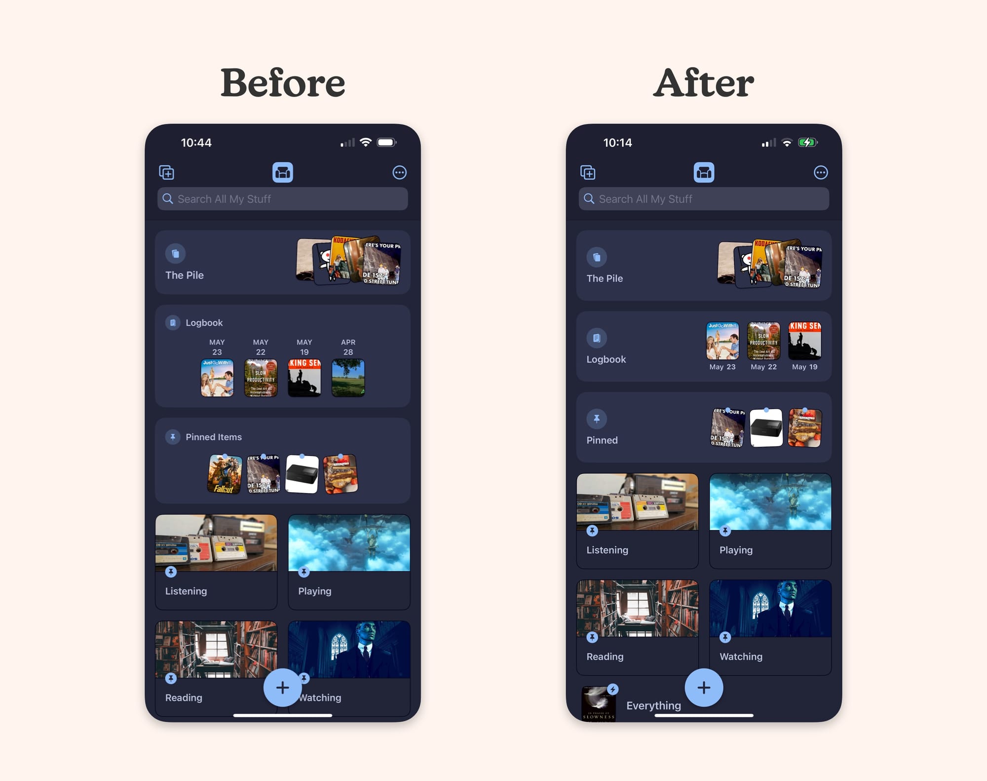
This new design brings a few benefits:
- The content is easy to scan
- There are still strong, visual differences between each card
- It takes up less vertical space to allow seeing more lists below
- It gives me a good template to design future cards (of which I have ideas)
- It still retains the quirky personality that I'm trying to bring to the app
While you do technically get less information than the previous design, I think you get enough information.
This design change is live as of Sofa 4.0.5.